Various clients

Improving UX & brand consistency across enterprise Power BI reports

Role

UX & UI Designer

Various clients

Improving UX & brand consistency across enterprise Power BI reports

Role

UX & UI Designer

Various clients

Improving UX & brand consistency across enterprise Power BI reports

Role

UX & UI Designer

Overview

C5’s Data & AI consultants build Power BI reports that provide organisations with accurate, well-structured analysis. Once that analytical foundation is in place, I focus on improving the UX and applying client branding.

I improved the usability of data visualisations and dashboards by applying simple UX principles. I also applied client branding to ensure reports felt credible, consistent, and appropriate for enterprise use.

I improved the usability of data visualisations and dashboards by applying simple UX principles. I also applied client branding to ensure reports felt credible, consistent, and appropriate for enterprise use.

I improved the usability of data visualisations and dashboards by applying simple UX principles. I also applied client branding to ensure reports felt credible, consistent, and appropriate for enterprise use.

Disclaimer

For confidentiality reasons, I’m unable to share screenshots of real client data.

Any visuals shown in this case study are simplified, anonymised, or fully redacted, and are intended to illustrate design approach and decision-making rather than reflect live datasets.

Disclaimer

For confidentiality reasons, I’m unable to share screenshots of real client data.

Any visuals shown in this case study are simplified, anonymised, or fully redacted, and are intended to illustrate design approach and decision-making rather than reflect live datasets.

Approach

Each engagement followed a similar process, adapted to the client.

  1. Work with the data consultants to understand the report, its audience, and the decisions it needed to support.

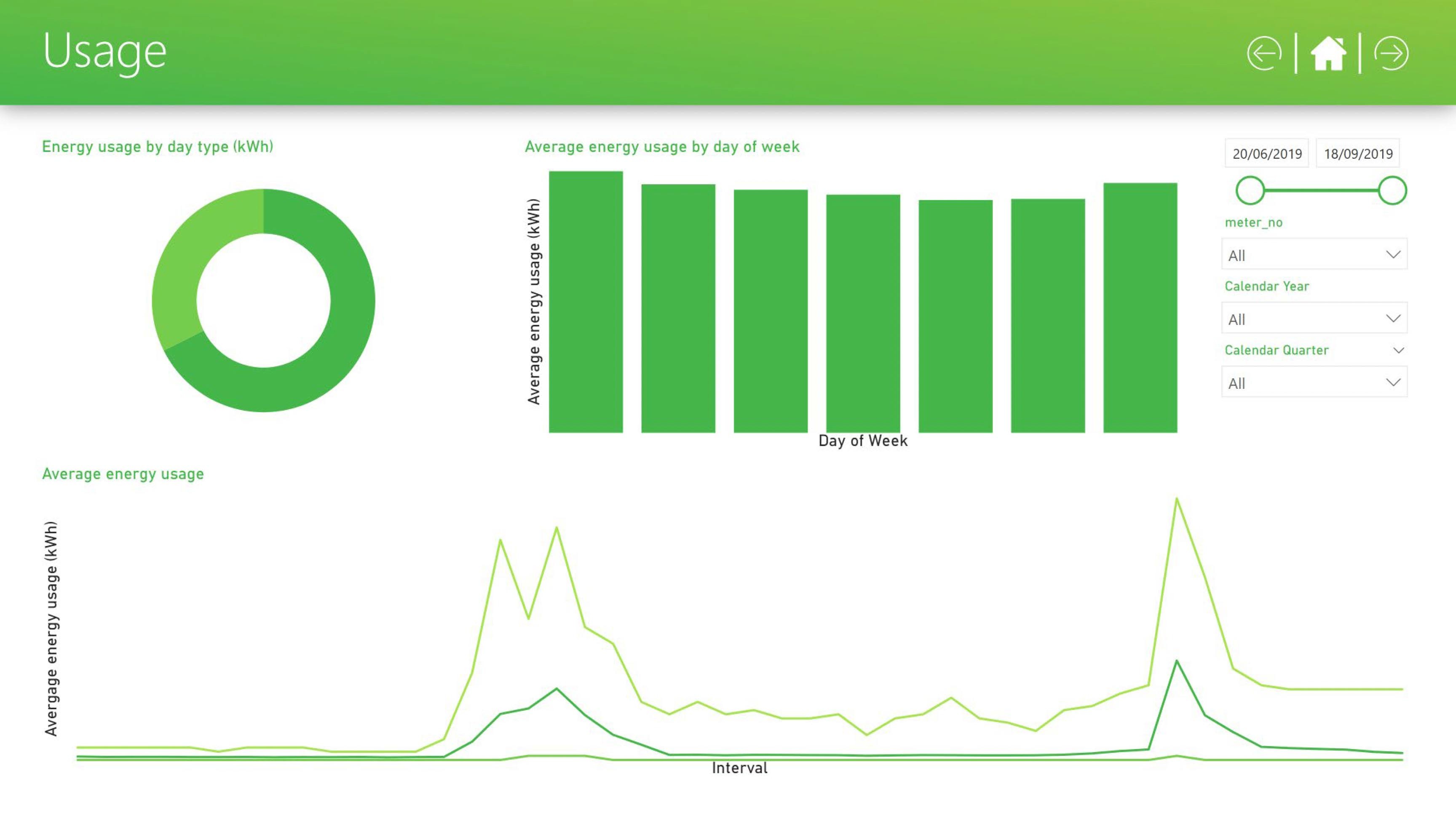
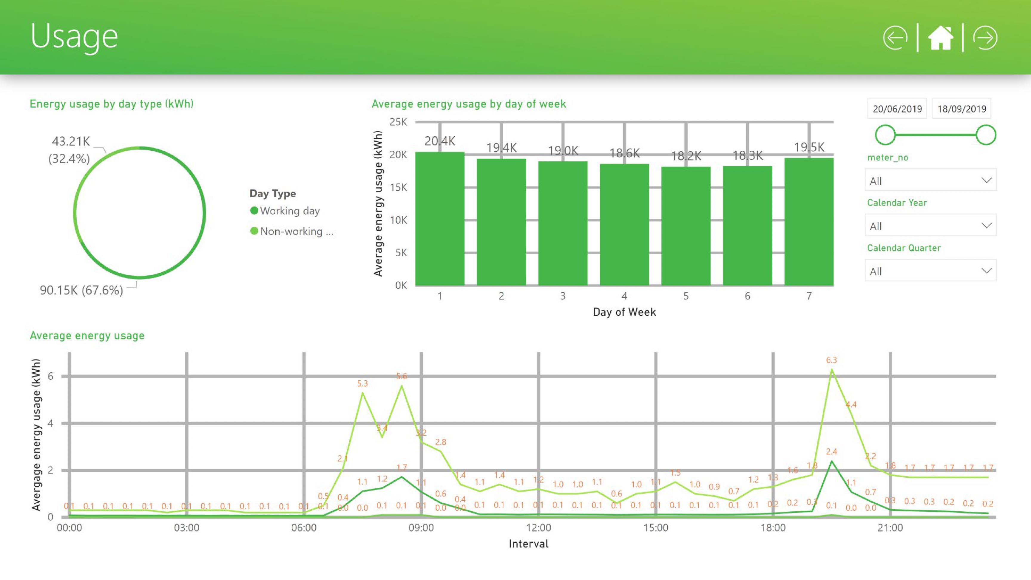
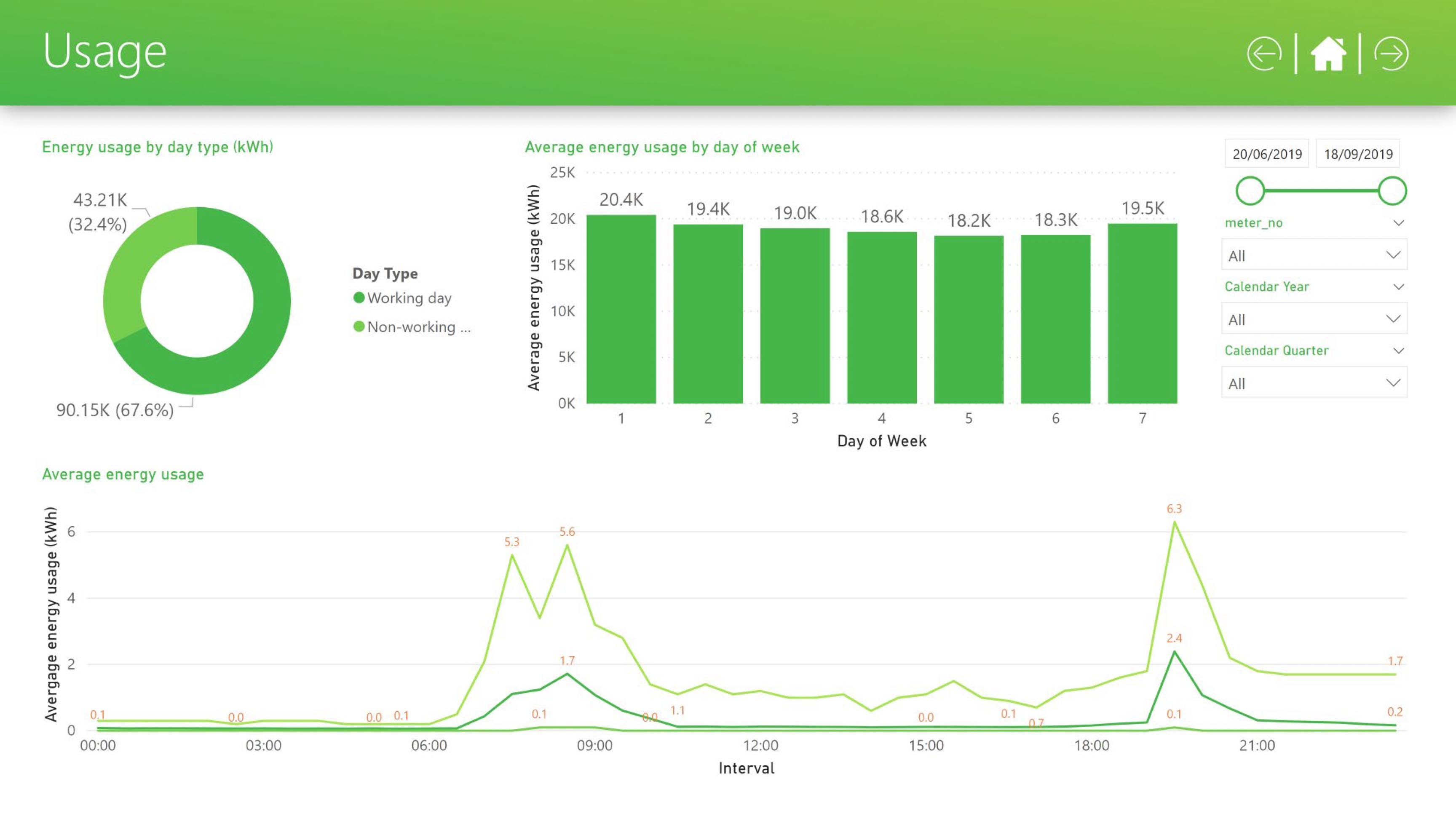
  2. Evaluate existing visuals and select chart types that best represented the data with the least cognitive effort.

  3. Refine interaction design: drill-downs, navigation, and how users moved between views.

  4. Review the client's brand guidelines and visual identity.

  5. Apply branding consistently across the report alongside the UX improvements.

  6. Author Power BI theme files so future reports could carry the brand without designer involvement

Common issues included:

  • Overloaded pages with competing visuals.

  • Inconsistent visual hierarchy and navigation.

  • Charts that were technically accurate but visually too complex.

  • Limited alignment with client brand guidelines.

  • No scalable approach to styling future reports.

This was a recurring issue across teams and clients, rather than a problem with the underlying data or the intent of the analysis.

This was a recurring issue across teams and clients, rather than a problem with the underlying data or the intent of the analysis.

This was a recurring issue across teams and clients, rather than a problem with the underlying data or the intent of the analysis.

UX & Data visualisation

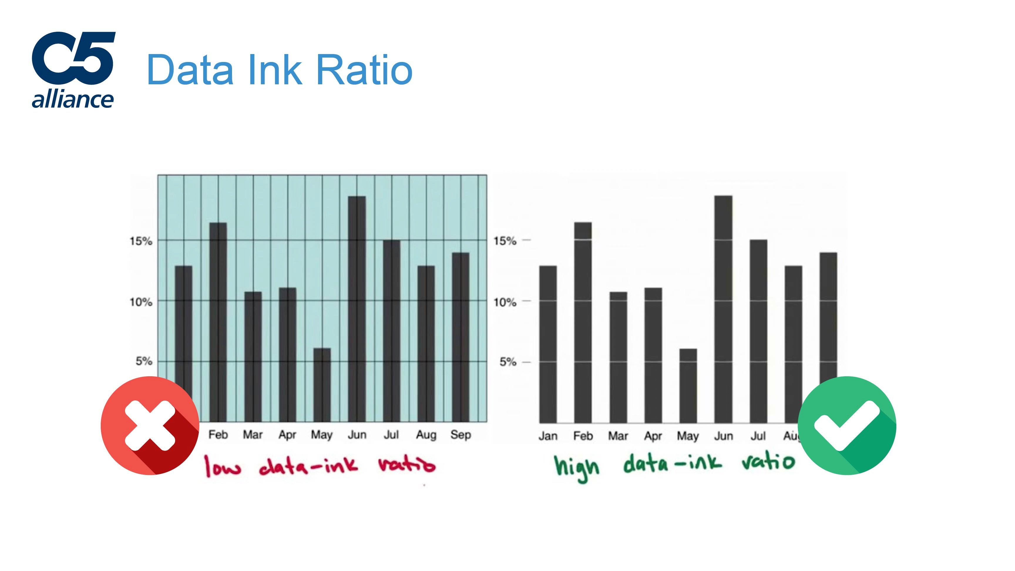
I applied the "5 Principles of Visual Design in UX" to restructure how data was presented, grouped, and prioritised across each report. Most of the work came down to reducing cognitive load.

I simplified layouts and clarified visual hierarchy so key metrics were easier to spot and understand quickly.

I simplified layouts and clarified visual hierarchy so key metrics were easier to spot and understand quickly.

I simplified layouts and clarified visual hierarchy so key metrics were easier to spot and understand quickly.

Where default chart types obscured the insight, I selected clearer alternatives that made the underlying pattern easier to read.

Where default chart types obscured the insight, I selected clearer alternatives that made the underlying pattern easier to read.

Where default chart types obscured the insight, I selected clearer alternatives that made the underlying pattern easier to read.

I refined interaction patterns, including drill-downs and report navigation, so users could move between views and reach the right insight without unnecessary effort.

I refined interaction patterns, including drill-downs and report navigation, so users could move between views and reach the right insight without unnecessary effort.

I refined interaction patterns, including drill-downs and report navigation, so users could move between views and reach the right insight without unnecessary effort.

No annotations

No annotations

Too many annotations

Too many annotations

Correct information density and labelling

Correct information density and labelling

No annotations

No annotations

Too many annotations

Too many annotations

Correct information density and labelling

Correct information density and labelling

Brand application

I applied each client’s brand guidelines consistently across reports, covering colour, typography, spacing, and overall visual tone.

I applied each client’s brand guidelines consistently across reports, covering colour, typography, spacing, and overall visual tone.

I applied each client’s brand guidelines consistently across reports, covering colour, typography, spacing, and overall visual tone.

This helped ensure reports felt coherent and professional when shared across teams and stakeholders.
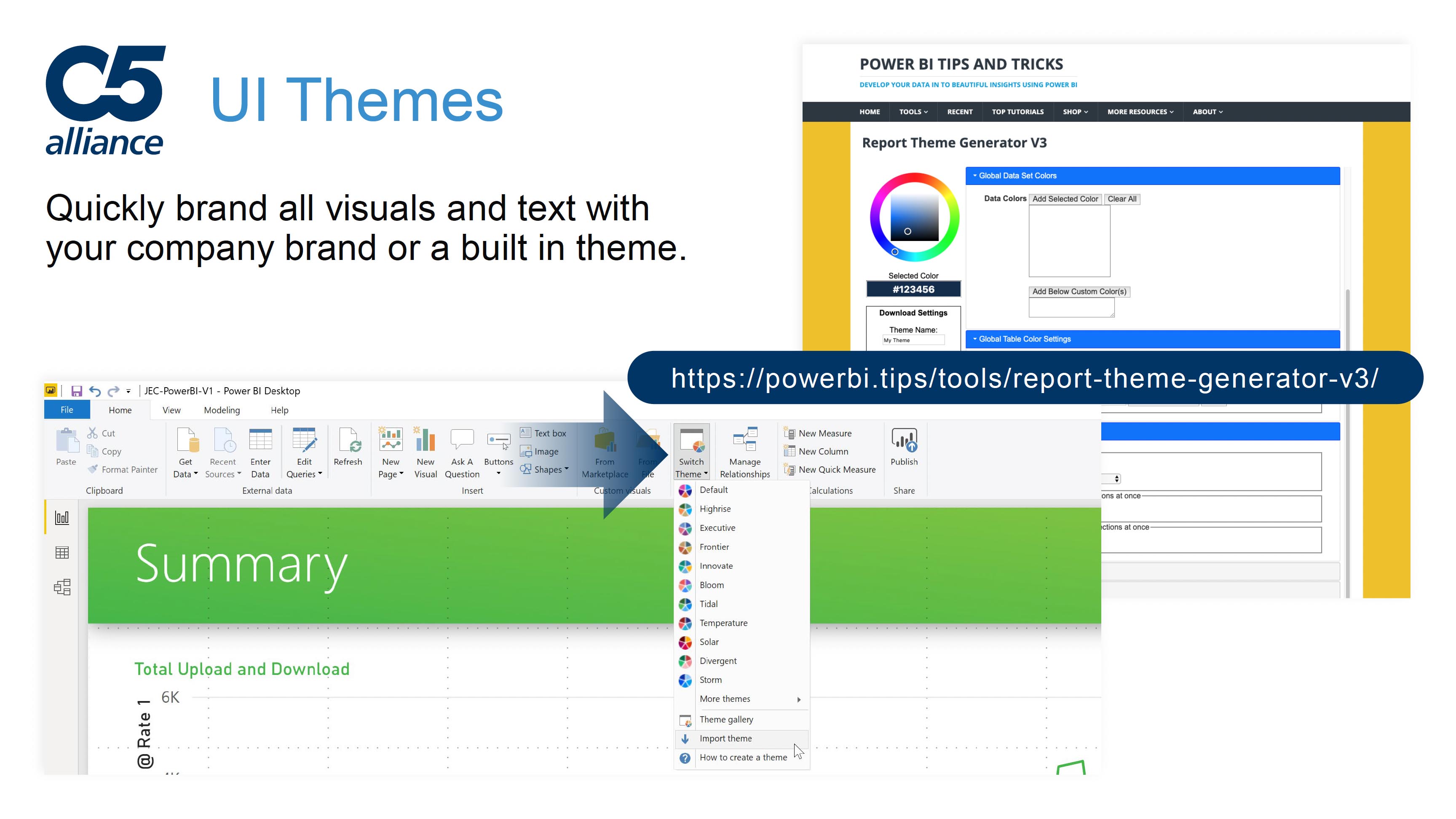
Waitrose dashboard, brand application

Waitrose dashboard, brand application

Waitrose dashboard, brand application

Waitrose dashboard, brand application

Scalable theming

I created Microsoft Power BI theme files for each client so branding could be applied consistently across new reports and sub-reports.

I created Microsoft Power BI theme files for each client so branding could be applied consistently across new reports and sub-reports.

I created Microsoft Power BI theme files for each client so branding could be applied consistently across new reports and sub-reports.

Power BI theme files are limited to visual styling. They do not support layout, interaction design, or navigation, which must be defined within each report.

Where needed, established layouts and navigation patterns could be reused by duplicating pages or components from existing reports.

This allowed teams to carry forward proven design patterns, but required manual copying rather than automatic inheritance.

This allowed teams to carry forward proven design patterns, but required manual copying rather than automatic inheritance.

This allowed teams to carry forward proven design patterns, but required manual copying rather than automatic inheritance.

If a higher level of refinement was needed, reports could be passed back to me for further UX and visual work.

Power BI .json UI themes

Power BI .json UI themes

Power BI .json UI themes

Power BI .json UI themes

Team enablement 

I developed and delivered a presentation on the role of UX and UI in Power BI for internal teams, data engineers, and clients.

The goal was to show how design decisions affect usability and trust, and to give teams practical guidance they could apply themselves.

The goal was to show how design decisions affect usability and trust, and to give teams practical guidance they could apply themselves.

The goal was to show how design decisions affect usability and trust, and to give teams practical guidance they could apply themselves.

"The Importance of UX in Power BI Reports" presentation cover

"The Importance of UX in Power BI Reports" presentation cover

Explaining concepts such as 'Data-Ink Ratio'

Explaining concepts such as 'Data-Ink Ratio'

"The Importance of UX in Power BI Reports" presentation cover

"The Importance of UX in Power BI Reports" presentation cover

Explaining concepts such as 'Data-Ink Ratio'

Explaining concepts such as 'Data-Ink Ratio'

Reflection

The underlying analysis in these reports was already solid. The gap was in how that work was presented and experienced.

My contribution was making the data easier to work with day to day: clearer layouts, more legible visuals, and navigation that helped people get to the insight they needed without friction.

By pairing that with consistent branding and reusable patterns, the quality of the reports held up as they were shared, reused, and extended across teams.

Contact me

Let’s build something great together

Contact me

Let’s build something great together

Contact me

Let’s build something great together